Deprecated: strpos(): Passing null to parameter #1 ($haystack) of type string is deprecated in /data/sites/web/expivicom/subdomains/wp3/wp-content/plugins/astra-addon/addons/advanced-hooks/classes/class-astra-wp-block-parser.php on line 36
Deprecated: strpos(): Passing null to parameter #1 ($haystack) of type string is deprecated in /data/sites/web/expivicom/subdomains/wp3/wp-content/plugins/astra-addon/addons/advanced-hooks/classes/class-astra-wp-block-parser.php on line 38
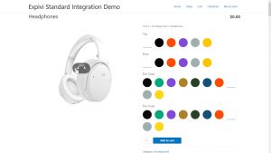
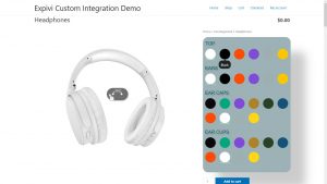
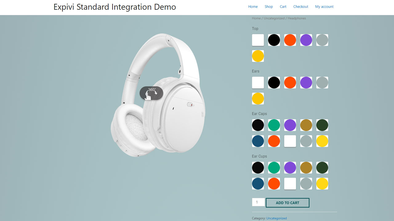
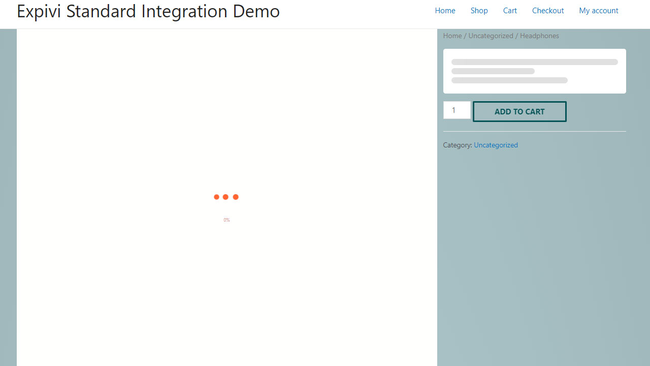
Although the Expivi’s standard 3D configurator already looks great (figure 1) or could be improved with a little bit of css styling and code tweaking (figure 2), the Expivi’s 3D configurator can be modified with JavaScript and CSS that it’ll completely blend in with your brand and website.
In this tutorial, we’ll show you how we used CSS and some coding to create the 3D configurator for WooCommerce like how it looks on this page.
Installing Expivi’s WooCommerce plugin
We’ll not cover the installation of the Expivi’s WooCommerce plugin here, as this can be found on our knowledge base.
The steps that needs be taken:
- Install WooCommerce
- Install Expivi’s WooCommerce plugin from the WordPress plugins directory
- In the Expivi plugin settings, add the API token key that you’ve created in your Expivi account
- Create a new WooCommerce product and under the Expivi settings, you can choose which 3D product you want to associate the product with
Use a WordPress page builder to make life easier
Although it’s not necessary to use one, we highly suggest you to use a page builder to design your pages. There are quite a few different page builders for WordPress on the market and each one has its pros and cons, but choose one you like. Keep in mind to do some thorough research and testing before choosing one, as switching to another page builder is very time consuming and is practically rebuilding your website.
On this demo website, we’ve used Elementor and is also the one we recommend as we know it works well with Expivi’s 3D configurator. Note: if you prefer other page builders, test out if it works well with Expivi first.
Let’s get started!
Global styling
Although this tutorial is not an Elementor tutorial, we will refer to specific settings, features and options which only are available in Elementor and necessary for this tutorial. There are tons of Elementor tutorial videos on YouTube.
All fancy animations you see on this page were created using Elementor’s standard settings.
To limit the number of modifications needed on a module level, it’s best practice to use the global settings of Elementor as much as possible, e.g. typefaces, fonts and colors. You can do this in the global settings of the Elementor plugins.
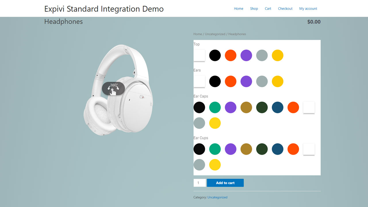
We’ll use the basic integration as starting point (figure 3), which will be using CSS styling to transform it as you can see at the top of this page.

Styling the product page
Styling the page has little to do with Expivi’s configurator, so we can go ahead and change the background color of the page. Because we want to have this background styling on only product pages, we add .single-product to the body element in our CSS code.
body.single-product {
background-color: transparent; background-image: radial-gradient(at center center, #BDDDDD 20%, #97ACB1 100%); }
This will make it look like this
WooCommerce’s standard layout will have the product name and price above configurator. We don’t want this in our new design, so let’s hide it.
.title-rating-price.xpv_price_top {
	display:none;
}
Changing the column layout of the configurator
WooCommerce’s standard product page 2 column 50/50 layout.
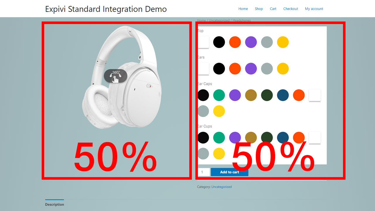
We think the Expivi’s 3D product should standout more, so we change it to a 70/30 layout, making the column of the options panel narrower and the column of the viewer wider.
Let’s add the following code:
div.expivi_viewer_outer_container {
		width: 69% !important;
		height: 100%!important;
	}
.expivi_viewer_inner_container, #viewer-container {
		width:100% !important;
		height: 70vh !important;
		float:left;
	}
div.summary {
		width: 30%!important;
	}
This will result in the following layout
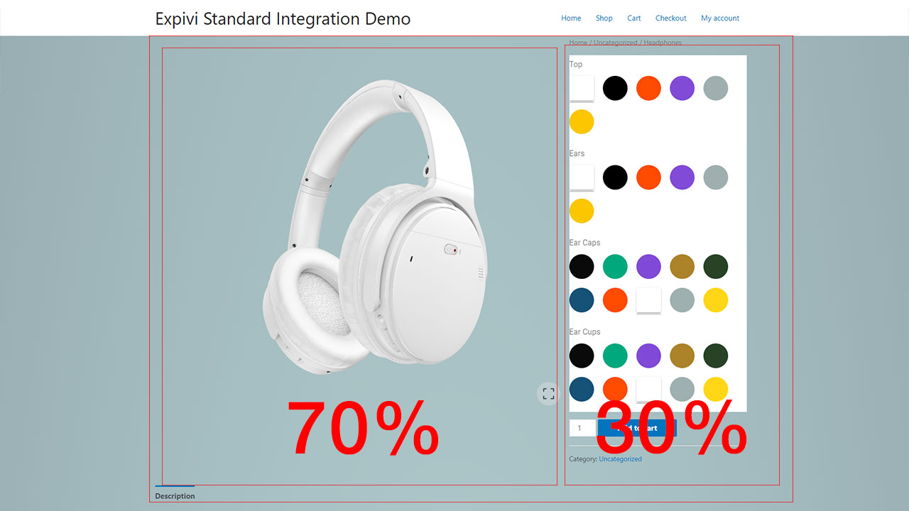
So what what did we exactly change exactly?
With the CSS styling for div.expivi_viewer_outer_container we make sure that the left column is not 50% but 70%. With the CSS styling applied on div.summary, we make sure that the options column is a bit smaller (30%).
With the CSS styling for .expivi_viewer_inner_container, #viewer-container we make sure that viewer (the window with the 3D product) stretches to full width of the column (70%). While we are at it, we’ve made the viewer much higher with height: 70vh !important;, so the product is shown in its full glory.
To make sure the 2 column isn’t pushed down by the first column, we’ve added float:left; to it.
Styling the quantity field and button
We want to make the quantity field and the add to cart button a little nicer. Since this is WordPress/WooCommerce related, we won’t elaborate on it.
The code used:
button.single_add_to_cart_button {
	border: 3px solid #055357!important;
	background: none!important;
	color: #055357!important;
	text-transform: uppercase;
}
.quantity.buttons_added a {
	border: 3px solid #055357!important;
	color: #055357;
	font-size: 2em!important;
	line-height: 1.17em!important;
}
.quantity.buttons_added input[type="number"] {
	color: #fff;
	background-color: #055357;
	border:none
}
Styling the options panel
All custom CSS code used in this section might not work entirely, as each configurator have its special settings and DOM elements (HTML tags). Contact us if you need help.
1. Let’s get rid of the white background in the options panel. Use the following code:
.theme--light.v-application {
	background:none;
}
This will result in
2. Let’s style the labels to something nicer. For this we need to style the CSS selector label.v-label
label.v-label {
	color: #055357!important;
	text-transform: uppercase;
	font-weight: bold;
}
3. Let’s style the options. This might sometime be a bit difficult to style, as there are multiple DOM elements (HTML tags) involved.
Let’s get rid of the white background of each option first and change them to circles. To finish it off, let’s add a small border around it. Use this code:
.theme--light.v-card {
	background-color:unset;
	border-radius:50px;
	border: 1px solid #055357!important;
}
Let’s make the options a bit smaller, so that the options have a more sleek design. Use this code for that:
.v-image, .color-tile {
	height:20px!important;
}
.tile-card {
	width:20px!important;
}
This will result in:
We’ve done it! We now have a 3D configurator which is styled to match the brand colors and is almost not recognizable from the standard integration.
Final touches
When the 3D viewer is loading, you see a white screen. Because the background of the entire page has a color, this just doesn’t look nice.
So let’s get rid of the background color of the loading screen. Use this CSS code and it will be gone!
#xpv__viewer_load_backdrop {
  background-color: unset!important;
}
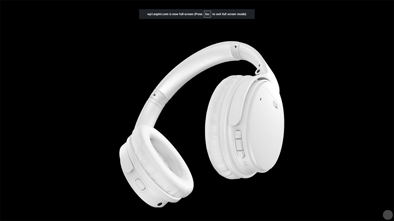
When you hover over the Expivi 3D viewer, you’ll see a full screen button, so that a visitor can view the 3D product in full screen mode.

When the 3D product doesn’t have a background, meaning the 3D product has a transparant background like the headphone example, going into full screen mode will show the background color that has been set in the browser settings of the visitor.
This results in e.g. a black background.
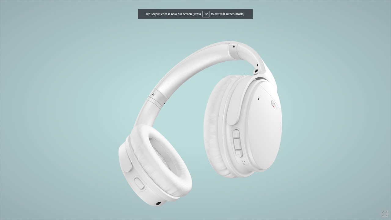
Let’s change this with some CSS code. For this example we use the following code:
::backdrop
{
    background-color: transparent;
    background-image: radial-gradient(at center center, #BDDDDD 20%, #97ACB1 100%);
}
*:fullscreen, *:-webkit-full-screen, *:-moz-full-screen {
    background-color: transparent;
    background-image: radial-gradient(at center center, #BDDDDD 20%, #97ACB1 100%);
}
This will result in a nice background when you enter full screen mode.
Animations
You see that there are animated elements on this page, e.g. the USPs. These are done with the standard settings of the Elementor page builder. As this is not an Elementor tutorial, we won’t dive into this. We refer to the many tutorial videos on Elementor on YouTube.